Tag: Web
-
My Dev Setup, part 3: Browser Testing
Some years ago browser testing meant just testing in Firefox, Safari and possibly Opera, and cursing and testing in IE6. Good standards support in current browsers has made development easier on one hand, but more complex than ever on the other hand with the demands of responsive design, the rise of mobile and websites themselves…
-
Miten varmistat, ettei käyttäjää suututa niin paljon
Emme yleensä pidä siitä, kun jokin menee pieleen tai ei toimi. Vielä vähemmän pidämme siitä, että meitä syytetään asioista, jotka eivät johdu meistä. Varsinkin suuressa ja ihmeellisessa “ATK-Internetissä” itsesyytökset ovat herkässä, kun jokin ei menekään niin kuin piti. Tätä tunnetta voi huomattavasti vähentää fiksuilla sanamuodoilla, kuten Twitter tekee, jos viserrys ei jostain syystä mennytkään perille:…
-
Miten saat käyttäjän suuttumaan
Yritin hiljattain varata vuokra-autoa kolmesta eri yhdysvaltalaisesta autonvuokrausfimasta verkon välityksellä. Lopulta vuokraus onnistui, mutta parilta ensimmäiseltä firmalta jäi asiakas saamatta yksinkertaisesti siitä syystä, etten tykkää siitä että minua kiusataan. Hertz veti pohjat. Varauslomakkeen yhteydessä kysytään paikkakunnan lisäksi, minä päivänä ja mihin aikaan auto halutaan vuokrata. Tämän jälkeen käyttäjälle näytetään lista autonvuokraamoista, jotka sijaitsevat lähellä toivottua paikkaa.…
-
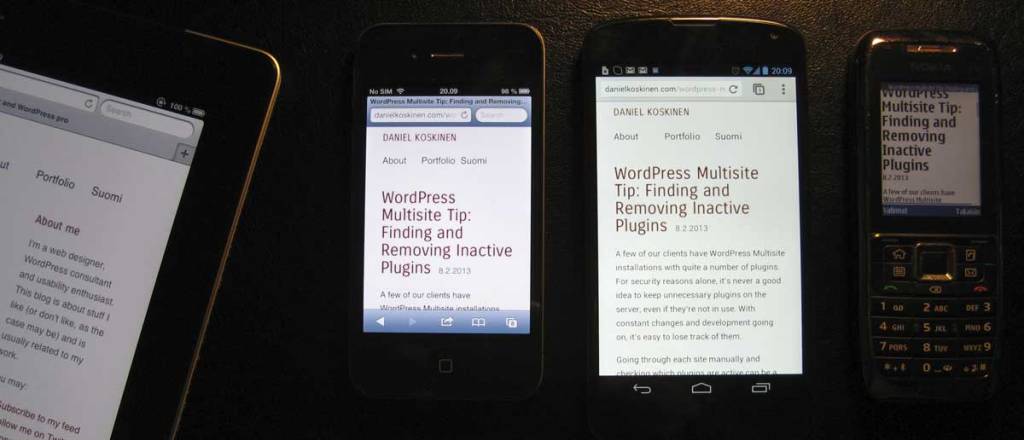
Mukautuvaa verkkosuunnittelua
Aki Björklund kirjoitti eilen blogissaan ytimekkään arvion Ethan Marcotten mainiosta Responsive Web Design -kirjasta. Luin saman opuksen toissaviikolla, ja allekirjoitan täysin Akin näkemyksen, että kirja on pakollista luettavaa kaikille verkkopalveluiden suunnittelijoille ja kehittäjille. Olen pohtinut, mikä olisi hyvä suomenkielinen vaihtoehto responsiiville. Responsive tarkoittaa sanakirjan mukaan vastaanottavaista, myötämielistä ja herkästi reagoivaa. Näistä mikään ei oikein tunnu hyvältä…
-
Flexible fluid layouts with CSS and jQuery (Part 2 in series)
In this post I’ll demonstrate with a simple example how easy it is, with CSS and a bit of jQuery, to make layouts that adapt to the many different screen sizes out there.
-
Should we design for wider screens? (Part 1 in series)
More and more people are using wide-aspect monitors to browse the web. According to forecasts by Tobii (Swedish eye-tracking equipment manufacturer) wide aspect monitor penetration will be almost 100% by 2012. I think those numbers might be a bit optimistic, since Tobii obviously wants to sell their new wide-screen eye-tracker. Despite that, a very large…
-
Make your own short URLs with WordPress
You might have noticed that I recently restored the main URL of my site to https://danielkoskinen.com . I decided it was a better idea to have my full name in the URL, and use my other domain (dani.fi) to generate my very own short URLs for use in Twitter & elsewhere.
-
Bad Google!
Can anyone suggest a good online feed reader and webmail which doesn’t begin with a G? Google Buzz created quite a stir from the start, with concerns over it’s privacy policy. The first time I logged in to see what all the buzz was about, I thought is was odd enough to see “followers” who…
-
Experimenting in HTML5 and CSS3
I decided to experiment with some of the new elements in HTML 5 and built my blog theme from scratch (with the help of the Carrington framework though). I’m now rolling article, section, header, footer and other stuff. Because IE needs a Javascript hack to enable support for these elements, I wouldn’t consider doing this…
 Daniel Koskinen