More and more people are using wide-aspect monitors to browse the web. According to forecasts by Tobii (Swedish eye-tracking equipment manufacturer) wide aspect monitor penetration will be almost 100% by 2012. I think those numbers might be a bit optimistic, since Tobii obviously wants to sell their new wide-screen eye-tracker. Despite that, a very large number of web users are using screens with well over 1024px width, but almost all web sites out there are designed for lower resolutions. This got me thinking about fluid layouts again, and I decided to share my thoughts.
Fixed-width equals compromise
In the Beginning web sites were fluid, that is the content adapted to browser width. Today, most web design is fixed-width. That is, we build web pages to a maximum of about 900-980 px to accomodate the majority of screens. I’ll be the first to admit that most of the stuff I’ve made is fixed-width. Even my own blog is designed to a 700px width! It’s generally easier to design this way, especially if the design originates in Photoshop, which is essentially static. Also, fluid layout generally used to mean ridiculously wide and unreadable blocks of text.
Problem is, designing this way is a compromise. Many users today have wide screen laptops with 1280 px width or more, but their screen height may be a mere 700-800 px. Subtract from that the space taken by browser toolbars, taskbar/dock etc and you’re not left with much. On these height-challenged displays we should be using all the horizontal space we can to provide users with the information they need. But what about those narrower displays then, or people who simply choose to have their browser window at a narrower width despite having a large display? We’re not going to force them to *gasp* scroll horizontally or resize, are we? That would be silly. The answer is “intelligent” fluid layouts.
Fill that width!
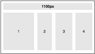
On sites that have clearly separable content blocks we could be building layouts that intelligently re-arrange according to browser width. That of course does mean some more work put into the design phase, and possibly ditching Photoshop as a layout tool! The above image is a wireframe of what a user would see on a wide screen (over, say, 1100px).
Narrowing down
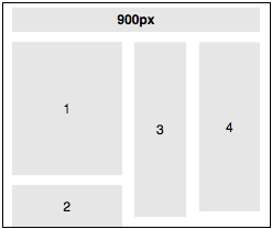
On screens about 1024px wide we rearrange slightly, moving one content block (eg. recent blog posts) below the first one.
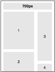
The narrower the screen is, the more we pile blocks on top of each other. This obviously requires more vertical scrolling, but all the content still remains accessible. Most importantly, we’re always using the best arrangement possible for the width of the browser.
Your thoughts?
What are you’re experiences of designing fluid layouts? Are there downsides to this, apart from the increased time needed for design? I’d like to here your thoughts, so please comment and share this on Twitter if you think it’s worth a discussion.
In Part 2, I’ll show an example of implementing the above with CSS and some jQuery, with sensible degrading in browsers with Javascript disabled.
 Daniel Koskinen
Leave a comment