-
Suunnittelukukkanen YTJ:n web-lomakkeessa
Painikkeen sijainnilla voi olla suuri merkitys web-lomakkeen käytettävyydessä. Oheisen kuvan mukaisessa Yritystietojärjestelmän osoitteenmuutoslomakkeessa varsinaisen lomakkeen välittömässä läheisyydessä on vain yksi painike, Tyhjennä. Syötetyn tiedon hävittäminen on siis tehty paljon helpommaksi kuin sen tallentaminen. (more…)
-
Hello HUB Tampere
I joined HUB Tampere today with a “Hub 5” membership, and look forward to meeting interesting people and hopefully gaining cool business opportunities and perhaps other forms of collaboration too. Time will tell how it pays off! (more…)
-
Käyttäjätietojen siirto Ningistä Buddypressiin
Boone Gorges on tehnyt ilmaisen skriptin käyttäjätietojen siirtämiseksi Ning-palvelusta WordPressiin. Lisäksi jos WP:hen on asennettu Buddypress-lisäosa, skripti tukee lisätietojen tuomista Buddypress-käyttäjäprofiileihin.
Suositun yhteisöpalvelun Ningin päätös muuttaa palvelu maksulliseksi taitaa nyppiä monia. Se on toisaalta tervetullut muistutus siitä, että webissäkin on kaupallisten palveluiden jostain rahansa saatava. Avoimen lähdekoodin ohjelmistot kuten WordPress ja BuddyPress sen sijaan mahdollistavat ohjien pitämisen omissa käsissä, vaikka ostaisikin sivuston räätälöinnin ja/tai ylläpidon ulkopuoliselta. Hyviä, edullisia webhotelleja on paljon, ja tiedostojen ja tietokantapohjaisen datan siirtäminen paikasta toiseen on helppoa jos yksi palveluntarjoaja menee nurin tai lakkaa miellyttämästä.
Alkuperäinen juttu: Ning to Buddypress Importer
-
Avainsanojen taivutus Twitterissä
Niin sanottujen hashtagien (esimerkiksi #tampere tai #taskubileet) käyttö on viime aikoina yleistynyt myös suomenkielisten twitter-käyttäjien keskuudessa. Niiden ideana on mahdollistaa johonkin aiheeseen liittyvän twiittailun seuraaminen esimerkiksi twitterin reaaliaikaisen haun avulla. Suomenkielisissä twiiteissä tulee vastaan kuitenkin erityislaatuinen pulma, nimittäin sanojen taivutus.
Tagia ei voi käytännössä hyödyntää jos haluaa käyttää sijamuotoja, koska haku ei enää tunnista sitä samaksi sanaksi. Olen huomannut joidenkin ratkaisseen tämän niin, ettei sijamuotoja yksinkertaisesti käytetä, tai sanan perusosan ja päätteen väliin jätetään tyhjää (esim. #tampere ella). Kummassakin tapauksessa syntyy luettavuudeltaan huonoa tekstiä.
Luettavuus on tärkeintä
Oma kantani tähän asiaan on sama kuin suhtautumiseni hakukoneoptimointiin yleensä: sisällön luettavuuden pitäisi olla aina ykkösasia. Twitterissä tämä jopa korostuu, varsinkin jos seurattavien määrä on suuri. Hyvin kirjoitettu teksti erottuu muista, ja vastaavasti vaikeaselkoiset viestit jäävät joko huomiotta tai saavat osakseen negatiivista huomiota. Käytetään siis hashtageja harkiten!
-
Flexible fluid layouts with CSS and jQuery (Part 2 in series)
2012 Update: This techniques outlined here have been mostly outdated by CSS3 Media Queries, which I recommend using instead.This is a follow-up to last week’s post, Should we design for wider screens?. In this post I’ll demonstrate with a simple example how easy it is, with CSS and a bit of jQuery, to make layouts that adapt to the many different screen sizes out there.
Example HTML
At the top level, my example HTML page has a #wrapper div, which contains a #header, #main div containing all the interesting stuff, and a #footer. The main section has #content, #primary, #secondary and #tertiary divs for the different content areas of my page. The first two content areas, #content and #primary are wrapped up in an additional #container div, but your own markup may obviously differ.
This file contains hidden or bidirectional Unicode text that may be interpreted or compiled differently than what appears below. To review, open the file in an editor that reveals hidden Unicode characters.
Learn more about bidirectional Unicode characters
<body class="normal> <div id="wrapper"> <div id="header"> … </div> <div id="main"> <div id="container"> <div id="content"> … </div> <div id="primary"> … </div> </div> <div id="secondary"> … </div> <div id="tertiary"> … </div> </div><!– #main –> <div id="footer"> … </div> </div><!– #wrapper –> </body> Prepare your styles
The basic idea here is to have different CSS styles for each width. The styles could be changed directly through jQuery, but that would quickly result in a lot of messy code. Instead, we’ll use jQuery only to change one class attribute. Initially I’ve added the class ‘normal’ to the
bodyelement to ensure a sensible default for browsers with JavaScript disabled, but we’ll also need styles for ‘wide’, ‘slim’ and ‘narrow’. This is easy to do with CSS descendant selectors:
This file contains hidden or bidirectional Unicode text that may be interpreted or compiled differently than what appears below. To review, open the file in an editor that reveals hidden Unicode characters.
Learn more about bidirectional Unicode characters
#wrapper { margin: 0 auto; } #header {overflow: hidden;} #container,#content,#primary,#secondary,#tertiary {float:left;} #footer {clear:left;width:100%;} /* Wide ( over 1100px ) */ .wide #container {width:60%;} .wide #content {width:66%;} .wide #primary {width:34%;} .wide #secondary,.wide #tertiary {width:20%;} /* Normal ( over 800px ) */ .normal #container {width:50%;} .normal #secondary,.normal #tertiary {width:25%;} /* Slim ( over 600px ) */ .slim #container{width:66%;} .slim #secondary,.slim #tertiary {width:34%;} /* Narrow ( under 600px ) */ .narrow #secondary,.narrow #tertiary {width:50%;} .narrow #secondary {clear:both;} Unfortunately versions 7 and older of Internet Explorer deal differently with percentage widths compared to most other browsers, and can result in some funny behaviour. I see two primary ways to deal with it: either feed IE 6 and 7 it’s own rules (e.g. a tested, fixed-width layout) or just make sure that the percentages never add up to 100 %. A nice explanation of this annoying feature can be found over at OJTech.com.
The jQuery
First of all I need to include jQuery, and perhaps the easiest way is to use Google’s jQuery for this. The main bit is a function, checkWidth() that (you guessed it) checks the width of the browser window and sets the body class attribute accordingly. The code below should be pretty self-explanatory.
This file contains hidden or bidirectional Unicode text that may be interpreted or compiled differently than what appears below. To review, open the file in an editor that reveals hidden Unicode characters.
Learn more about bidirectional Unicode characters
function checkWidth () { if ($(window).width() > 1400) { $('body').attr('class','superwide'); $('#title').text('Wide ('+$(window).width()+')'); } else if ($(window).width() > 1100) { $('body').attr('class','wide'); $('#title').text('Wide ('+$(window).width()+')'); } else if ($(window).width() > 800) { $('body').attr('class','normal'); $('#title').text('Normal ('+$(window).width()+')'); } else if ($(window).width() > 600) { $('body').attr('class','slim'); $('#title').text('Slim ('+$(window).width()+')'); } else { $('body').attr('class','narrow'); $('#title').text('Narrow ('+$(window).width()+')'); } } In addition to this, all I need is some code that will tell the browser when to run the
checkWidth()function.
This file contains hidden or bidirectional Unicode text that may be interpreted or compiled differently than what appears below. To review, open the file in an editor that reveals hidden Unicode characters.
Learn more about bidirectional Unicode characters
$(document).ready(function(){ // check the window size when page loads checkWidth(); // check on resize $(window).resize(function() { checkWidth(); }); }); That’s it!
View the finished demoEDIT: I’ve managed to lose the demo at some point in time. Anyway a better and more flexible way of doing this is CSS3 Media Queries, and you should use them.After starting to write this post, I read the latest issue (#200) of .net magazine and noticed a mention of a very cool way to do a similar trick using only CSS media queries! Media Query demo by Bruce Lawson. Haven’t tried it out yet, but I definitely will.
Hope you liked the post, feel free to tweet it, or leave a comment below.
-
Should we design for wider screens? (Part 1 in series)
More and more people are using wide-aspect monitors to browse the web. According to forecasts by Tobii (Swedish eye-tracking equipment manufacturer) wide aspect monitor penetration will be almost 100% by 2012. I think those numbers might be a bit optimistic, since Tobii obviously wants to sell their new wide-screen eye-tracker. Despite that, a very large number of web users are using screens with well over 1024px width, but almost all web sites out there are designed for lower resolutions. This got me thinking about fluid layouts again, and I decided to share my thoughts.
Fixed-width equals compromise
In the Beginning web sites were fluid, that is the content adapted to browser width. Today, most web design is fixed-width. That is, we build web pages to a maximum of about 900-980 px to accomodate the majority of screens. I’ll be the first to admit that most of the stuff I’ve made is fixed-width. Even my own blog is designed to a 700px width! It’s generally easier to design this way, especially if the design originates in Photoshop, which is essentially static. Also, fluid layout generally used to mean ridiculously wide and unreadable blocks of text.
Problem is, designing this way is a compromise. Many users today have wide screen laptops with 1280 px width or more, but their screen height may be a mere 700-800 px. Subtract from that the space taken by browser toolbars, taskbar/dock etc and you’re not left with much. On these height-challenged displays we should be using all the horizontal space we can to provide users with the information they need. But what about those narrower displays then, or people who simply choose to have their browser window at a narrower width despite having a large display? We’re not going to force them to *gasp* scroll horizontally or resize, are we? That would be silly. The answer is “intelligent” fluid layouts.
Fill that width!
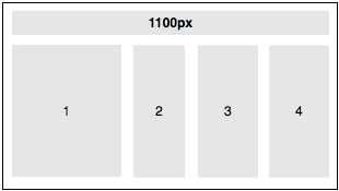
On sites that have clearly separable content blocks we could be building layouts that intelligently re-arrange according to browser width. That of course does mean some more work put into the design phase, and possibly ditching Photoshop as a layout tool! The above image is a wireframe of what a user would see on a wide screen (over, say, 1100px).
Narrowing down
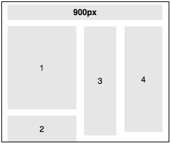
On screens about 1024px wide we rearrange slightly, moving one content block (eg. recent blog posts) below the first one.
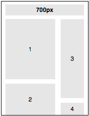
The narrower the screen is, the more we pile blocks on top of each other. This obviously requires more vertical scrolling, but all the content still remains accessible. Most importantly, we’re always using the best arrangement possible for the width of the browser.
Your thoughts?
What are you’re experiences of designing fluid layouts? Are there downsides to this, apart from the increased time needed for design? I’d like to here your thoughts, so please comment and share this on Twitter if you think it’s worth a discussion.
In Part 2, I’ll show an example of implementing the above with CSS and some jQuery, with sensible degrading in browsers with Javascript disabled.
-
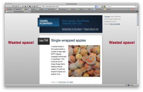
Single-wrapped apples
 I noticed these in the supermarket a couple of days ago. WTF? Apples, wrapped individually in styrofoam. This must be one of those things that’s helping reduce waste, I’m just too stupid to figure out exactly how…
 -
Make your own short URLs with WordPress
You might have noticed that I recently restored the main URL of my site to https://danielkoskinen.com . I decided it was a better idea to have my full name in the URL, and use my other domain (dani.fi) to generate my very own short URLs for use in Twitter & elsewhere.
(more…) -
New “Privacy on” alert in WordPress 3.0
 Sometimes it’s the little details that make you smile. When a new WP site is in development, you obviously don’t want it to be visible to search engines. A simple setting in the installation process (and the admin) allows you to choose this, but it can be easy to forget once you’ve set it.
About a week ago a submission to the WordPress trunk enabled a new mini-alert in the admin header, which reads “Privacy on” when the blog is hidden from search engines. Small addition, but very helpful when going live with a new site! I hope this feature remains in the final 3.0 release (due in May according to the current project schedule).
-
Post Types in WordPress 3.0 and Pods
One of the biggest things I have been looking forward to in the upcoming WordPress 3.0 release are Custom Post Types. Funnily enough though, now they’re actually on their way, I’m not so excited about them any more.
This is mostly due to the wonderful Pods framework by Matt Gibbs and Scott Kingsley Clark. Pods is a WordPress Plugin, but in reality almost a CMS in its own right. It allows you to create all kinds of custom post types, along with customized admin screens (with the Pods UI add-on) that blend nicely with the WP interface. (more…)
-
Subscribe
Subscribed
Already have a WordPress.com account? Log in now.
 Daniel Koskinen