-
Sublpress: Manage WordPress Sites in Your Text Editor
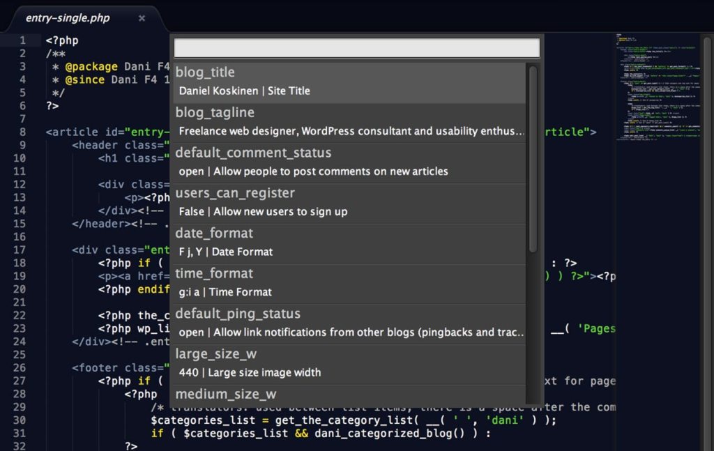
Sublpress is a new extension for Sublime Text by Nic Dienstbier that makes it possible to manage your WordPress site (or multiple sites) in the editor. Currently you can edit settings, create and edit posts and manage taxonomy terms. All features can be easily accessed via the Command Palette.

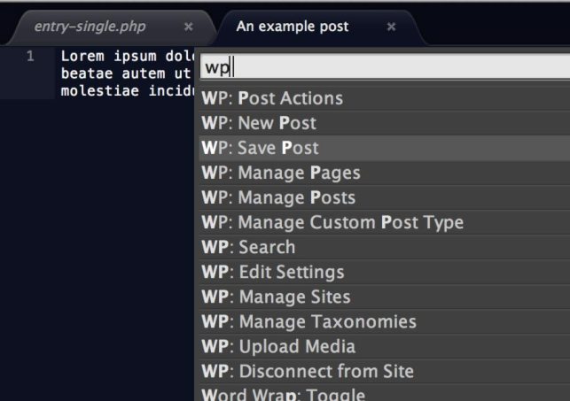
Creating a new post with Sublpress I tested Sublpress in both Sublime Text 2 and beta of Sublime Text 3, and my initial impressions are it seems to be a bit more stable (ironically) in the latter. This could be just something relating to my setup however.
Sublpress options I’m still not entirely sure whether I want to manage my WordPress sites in my text editor, but if it sounds like fun to you, go get Sublpress on GitHub. 🙂
-
Tappara on kuparinikkeliä

…ja alumiinipronssia ja mitä niitä nyt on. Tampereen Sammonkadulla sijaitsevan numismatiikan erikoisliikkeen suosikkijääkiekkojoukkue ei jää epäselväksi.
-
Ihmiset ovat sekopäitä läskimahoja

Aku Ankan taskukirjassa nro 115 (Sanomaprint 1989) tiedettiin tietokoneiden turmiollisuus.
-
My Dev Setup, part 4: Version Control and Deployments with WordPress
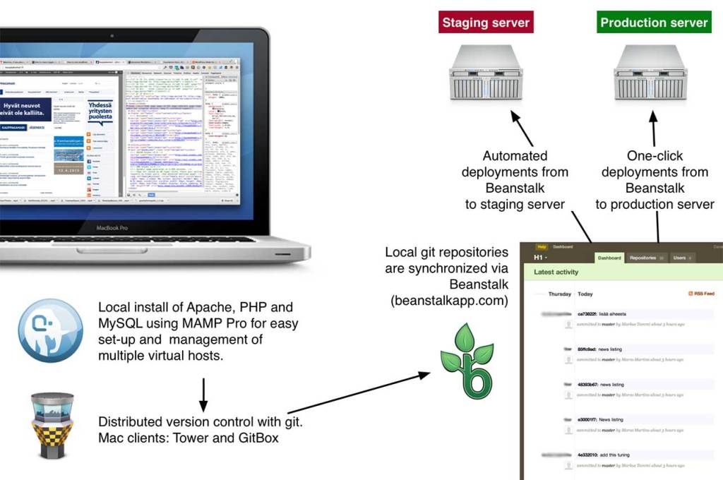
In an earlier post, I promised to shed some light on our git workflow for WordPress projects. The above image sums it up pretty nicely, but read on for the details.
Most of the development we do happens in a local Apache + PHP + MySQL environment, using MAMP Pro. That means I have a local copy of each site I’m developing, which creates some overhead compared to everyone just working on a central dev server. It’s worth it though because it makes working on different features and code branches easy.
Repository structure
Every project has its own git repository, which we set to the WordPress root directory. This is because most of our projects involve a combination of custom themes and plugins, and it makes sense to group them in a single repository. We still don’t want any of the core WordPress code in git, so we use a .gitignore file based on this excellent template by Joe Bartlett:
This file contains hidden or bidirectional Unicode text that may be interpreted or compiled differently than what appears below. To review, open the file in an editor that reveals hidden Unicode characters.
Learn more about bidirectional Unicode characters
# This is a template .gitignore file for git-managed WordPress projects. # # Fact: you don't want WordPress core files, or your server-specific # configuration files etc., in your project's repository. You just don't. # # Solution: stick this file up your repository root (which it assumes is # also the WordPress root directory) and add exceptions for any plugins, # themes, and other directories that should be under version control. # # See the comments below for more info on how to add exceptions for your # content. Or see git's documentation for more info on .gitignore files: # http://kernel.org/pub/software/scm/git/docs/gitignore.html # Ignore everything in the root except the "wp-content" directory. /* !.gitignore !wp-content/ # Ignore everything in the "wp-content" directory, except the "plugins" # and "themes" directories. wp-content/* !wp-content/plugins/ !wp-content/themes/ # Ignore everything in the "plugins" directory, except the plugins you # specify (see the commented-out examples for hints on how to do this.) wp-content/plugins/* # !wp-content/plugins/my-single-file-plugin.php # !wp-content/plugins/my-directory-plugin/ # Ignore everything in the "themes" directory, except the themes you # specify (see the commented-out example for a hint on how to do this.) wp-content/themes/* # !wp-content/themes/my-theme/ The above means that in practice the contents of a typical project repository structure looks somewhat like this:
/
+-- wp-content/
    |-- plugins/
    |   +-- custom-plugin/
    |
    +-- theme/
        +-- custom-theme/
Sharing code and automated staging with Beanstalk
When I want to share code with my colleagues or am ready to something to a client, I do a git push to a central repository hosted on Beanstalk. Beanstalk has loads of useful features, but the best thing about it has to be the simple deployments it offers. For all projects, we set up automated deployments to a staging server, where we have copies of each site. Deployments to production are also set up in Beanstalk, but (intentionally) require a manual click in the web app.
Going to production
Finally, moving from staging to production can require some tricky search-and-replacing domains and absolute paths in the database. WordPress in Network mode tends to be particularly keen on saving the site URL in way too many places. One way to do this is to perform a search and replace on a SQL dump, but we use this nifty tool by Interconnect/IT, because it correctly handles serialised strings, which are often used in WordPress for things like widget options etc. The same tool is useful when doing the reverse, ie. creating a local copy of an existing site.
Relevant links:
-
Easter Photos 2013

A series of photos I took this Easter near the centre of Tampere. Spring is about two weeks late this year, I’m hoping the snow melts soon!


-
Mun kasa on sun kasa

Asuinalueemme takana meitä on jo parin vuoden ajan viihdyttänyt Tampereen kaupungin lumenkaatopaikka. Tänä talvena toiminnan aiheuttama melu on käynyt jo niin häiritseväksi, että pari taloyhtiömme aktiivia laati naapuriyhtiöiden kanssa asiasta valituksen.
Yle raportoi asiasta toissapäivänä, ja päädyin epähuomiossa haastateltavaksi: http://yle.fi/uutiset/lumivuori_pilaa_nakoalan_ja_younet/6555146
-
Staying Connected, Working from Home

Working from home is great, especially when starting each day would otherwise mean a two-hour train journey to Helsinki. On the downside I sometimes feel disconnected from my colleagues, since I only see them in person about once or twice a month. Of course we have video conferences when there’s a matter we need to discuss, but the spontaneous questions and chats of the workplace are lost. So a couple of weeks ago I had a revelation: why not just leave the connection on? Using an iPad at home (which I don’t usually need during the work day) and a spare laptop at the company HQ, we established our little virtual window. It’s not in anyone’s face, so it’s more informal than having an actual video meeting, but allows us to ask questions and share knowledge (and bad jokes) throughout the work day as if we were all in the same room.
-
Debugging SASS in Chrome
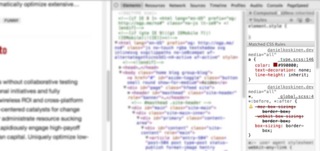
In Firefox, viewing the original SASS line number directly has been possible using Firebug and FireSass. Similar, or even better functionality has very recently arrived in the stable release of Chrome. I just tried this out and it works wonderfully. See here for instructions:
How to make Chrome understand the SASS/SCSS in your rails app
Don’t worry about the Rails stuff, these instructions work just as well for stand-alone SASS. If you’re using Compass like me, you need to set sass_options = {:debug_info => true} in the
config.rbfile of your project.If you look at your css files after doing the above, you’ll see they are quite a mess. From a comment by Paul Irish in the above post I learnt better stuff is on its way thanks to the upcoming SASS 3.3, and Source Map support in Chrome:
Debugging SASS with Source Maps
Exciting times!
-
Simple Conditional Loading in WordPress

Over a year ago, Jeremy Keith wrote an excellent post on enhancing the performance of responsive sites by checking for a minimum screen width before loading secondary content such as related news and latest tweets. Mobile devices would just show a link to the content, thus keeping it accessible. In this post I’ll show how to do a similar thing in WordPress.
Method 1: Custom page templates
I thought there should be an easy way to delay the loading of any secondary content, and my first thought was to use the very simple
.load()method in jQuery along with a custom page. For instance you could create a special template to show related blog posts, and display a link to that page. On wide screens this link can be replaced with the content of your custom page using ajax. This is a perfectly valid way of doing it, especially if you have only one or two pieces of secondary content.Method 2: Custom Endpoints
What if I want to conditionally load the WordPress sidebar on every page, and the contents of the sidebar is not necessarily the same everywhere? Creating page templates and pages for all that secondary content can become messy and error-prone. My esteemed colleague (and boss) Aki suggested a better way of doing this would be to check for a specific parameter in PHP and generate either the main content or the sidebar. All we need is the sidebar version of the page to have its own URL. Enter
SandmanWordPress Endpoints!URL endpoints are part of the Rewrite API, and are used for many things, among others to generate feeds (via
/feed/) and paging (eg./page/2/to see older posts or the second part of split post). The following code will register a new endpoint/part/.
This file contains hidden or bidirectional Unicode text that may be interpreted or compiled differently than what appears below. To review, open the file in an editor that reveals hidden Unicode characters.
Learn more about bidirectional Unicode characters
<?php /** * Add a new /part/ endpoint. Access the value of part by * using get_query_var( 'part' ) in a theme template. */ add_filter( 'init', 'h1ep_add_rules' ); function h1ep_add_rules() { // this will register the endpoint for all WordPress URLs add_rewrite_endpoint( 'part', EP_ALL ); } ?> The above code should go in the theme functions.php file, or better yet, a separate plugin. To make the endpoint actually work you might have to clear your rewrite rules — simply opening the WordPress Permalinks settings and saving should do the trick.
Now the endpoint is registered, you can access it in PHP using the built-in WordPress function
get_query_var(). For example, you could construct yoursidebar.phptemplate like this:In the above example, when we access a URL ending /part/sidebar/, the condition will evaluate to true. So now we have an accessible, functional solution with cacheable URL’s. We’ll just add some jQuery magic to load the sidebar content in place on wider screens:
This file contains hidden or bidirectional Unicode text that may be interpreted or compiled differently than what appears below. To review, open the file in an editor that reveals hidden Unicode characters.
Learn more about bidirectional Unicode characters
// Load asides var asideLoader = $('#load-asides'); var asideContainer = $('#sidebar'); var loadAsides = function () { var href = asideLoader.attr('href'); asideContainer.load( href + ' #sidebar-content'); } // Check for screen width and load asides if we're wide enough if ( document.documentElement.clientWidth > 768 ) ) { loadAsides(); } If you also want to support ajax loading on smartphones, add this to trigger it with a tap/click:
This file contains hidden or bidirectional Unicode text that may be interpreted or compiled differently than what appears below. To review, open the file in an editor that reveals hidden Unicode characters.
Learn more about bidirectional Unicode characters
asideContainer.on( 'click', '#load-asides', function(e) { e.preventDefault(); loadAsides(); } ); That’s all! A functioning demo can be seen on this blog: try loading it on a small screen vs. a wide screen.
- Jeremy Keith’s original post on 24 Ways: Conditional Loading for Responsive Designs
- More information on endpoints in the Codex.
-
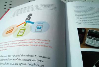
The Mobile Book by Smashing Magazine

I’ve just finished reading through The Mobile Book by Smashing Magazine. The book is a fully packed 334 pages of analysis on the current state of mobile and best responsive design practices. Writers include gurus such as Peter-Paul Koch, Stephanie Rieger and Brad Frost.
Bottom line: most people working in web design today should probably read this book, whether they’re designers or developers. The book has useful data on today’s mobile landscape, discussion on how to bake responsive design into our processes, the peculiarities of designing for touch and instructions on how to optimize for mobile.
From the foreword (by Jeremy Keith):
There will come a time when this book will no longer be necessary, when designing and developing for mobile will simply be part and parcel of every Web worker’s lot. But that time isn’t here just yet.
Jeremy KeithHere are my six key points I gathered from the book:
- The Internet of Things is a thing, and is likely to explode in the near future with more Internet-connected devices entering the market that are neither traditional mobile devices nor desktops or laptops. Some don’t even have screens.
- Responsive design that focuses only on screen size can result in huge downloads on mobile. We need to pay more attention to conditional loading of secondary content.
- Creating detailed Photoshop comps of web sites can set false expectations to clients and other stakeholders. Responsiveness should be part of the design process very early on.
- The capabilities of mobile browsers vary wildly (especially on Android), and browser/device detection is increasingly a necessary evil. RESS (Responsive design + server-side components) and server-side libraries like Detector (by Dave Olsen) are a possible solution.
- With new hybrid touch-enabled devices, we are less likely to be able to predict whether the user can use touch as an input method. Due to this we need to optimize for touch by default.
- Touch interfaces take web design into the realm of industrial design. It’s no longer just about how things look and behave, we also need to consider how people hold their devices. This has significance when deciding where to put key controls.
The Mobile Book is available here.
The print edition is probably the most high quality book Smashing Magazine has produced so far. A real pleasure to read! Regarding point 2 in my list: I’ll be presenting a simple example on how to use conditional loading for any content in WordPress in an upcoming post. The same method is used on this site to load the sidebar. Edit: it’s now online, see Simple Conditional Loading in WordPress.
You may follow me on Twitter.


-
Subscribe
Subscribed
Already have a WordPress.com account? Log in now.
 Daniel Koskinen