I’ve been playing around with various CSS frameworks for the past eight years. All these frameworks like Foundation, Bootstrap and Blueprint have really only served one purpose for me: to disguise the fact that until now, layout in CSS has been a hack.
Floats were the best tool we had available at the time, but they were never really meant for full-page layout, they were meant for floating an image next to a block of text. Because of this, faking a grid with floats requires careful calculations of widths, setting margins and results in pages that can easily break when the content changes or isn’t what the designer or developer intended. The frameworks a lot of us relied on hid most of this complexity.
What about Flexbox?
A few years ago it seemed like Flexbox was going to change all this, and in some ways it did. We could now put elements side by side and make them equal-height without resorting to hard-coded heights or JavaScript. That was nice. We could also easily centre items both horizontally and vertically without any trickery. Items could also wrap onto multiple rows.
However, using Flexbox to build a two-dimensional grid is also a hack. So all those frameworks just transitioned to using Flexbox. It was better than using floats, but still a hack.
Diving into CSS Grid
So how is CSS Grid different? CSS Grid has just appeared during the past year in modern browsers and has been implemented at an astonishing speed (compared to many previous CSS features). I’m not going to try to explain everything CSS Grid can do here, but I’ll cover the basics, show some examples and then discuss what that means for the future.
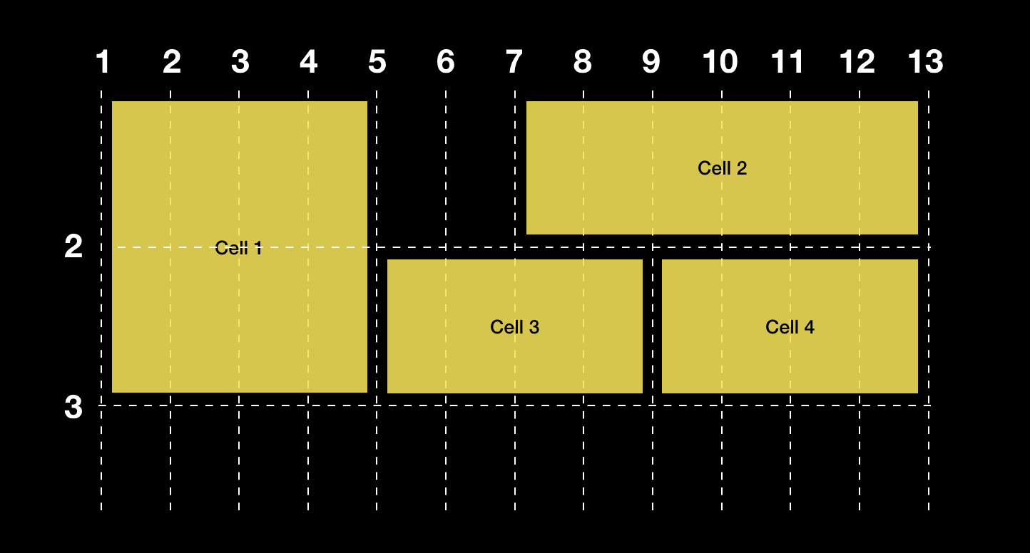
A 12-column Grid using Grid
We’ve got a traditional 12-column grid and three items we want to place onto it, 4 columns each. Using flexbox (example adapted from Foundation) it would look something like the following example:
HTML:
<div class="grid">
	<div class="cell small-4">
	Cell 1
	</div>

	<div class="cell small-4">
	Cell 2
	</div>

	<div class="cell small-4">
	Cell 3
	</div>
</div>
CSS:
.grid-x {
	display: flex;
	flex-flow: row wrap;
}
.cell {
	padding: 1rem;
	background: yellow;

	flex: 0 0 auto;
	min-height: 0px;
	min-width: 0px;
	width: 100%;
}
.grid-margin-x > .small-4 {
	width: calc(33.33333% - 1rem);
}
In CSS Grid, it would look like this:
.grid {
	display: grid;
	grid-template-columns: repeat(12, 1fr);
	grid-gap: 1rem;
}
.cell {
	padding: 1rem;
	background: yellow;
}
.small-4 {
	grid-column: span 4;
}
Similar to flexbox, I set the parent element to display: grid. The big difference are the new CSS properties grid-template-columns, grid-gap on the parent which actually define what the grid should be, and grid-column on the child element (.small-4 in this case because I wanted to keep the same markup from the previous example).
The value of grid-template-columns is repeat(12, 1fr) which the browser interprets as “divide the available space equally between 12 columns”.
The big difference here compared to our previous example is that instead of having to calculate and set the width of the small-4 element, I’m just saying “I want this to span 4 columns”.
A closer look at grid-template-columns and grid-template-rows
These two properties allow you to define arbitrary tracks (a common term for columns and rows). Here for example we’re defining one 200px column and another 800px column.
grid-template-columns: 200px 800px;These are obviously fixed-width. In this next example, the second column has been changed to be flexible using the new fr unit.
grid-template-columns: 200px 1fr;fr stands for “fraction of the available space”, so this second column will now expand to take up as much space as it can within its parent container, after space for fixed-width columns has been reserved.
The cool thing about the fr unit is we can easily add a second column like this:
grid-template-columns: 200px 1fr 1fr;Notice how now both the 2nd and 3rd columns are 1fr. First the browser will add up those units (1 1), divide up the available space by the total (2) and then allocate the space to the individual columns. So if I were to change the second column to 2fr, its width would be twice the size of the third column.
So back to our 12-column example, we could define that grid like this: 1fr 1fr 1fr 1fr 1fr 1fr 1fr 1fr 1fr 1fr 1fr 1fr but luckily CSS Grid supports a handy repeat notation which allows us to just write repeat(12, 1fr). The repeat notation can also be used to repeat a pattern, such as repeat(12, 1fr 50px) which would make every other column 50 px and the rest would be split up evenly based on the available space.
Rows work exactly the same:
grid-template-rows: 200px min-content;In the above code, min-content is a way of saying “I want this track to be whatever the minimum size is that my content needs”. There are loads of keywords like this, you should read up on all the ways to size tracks here.
Gutters using grid-gap
We no longer need to bother with paddings or margins to create fake gutters, because the grid spec has a new property just for that, grid-gap. In the latest spec version this has been shortened to just gap, hopefully meaning that we might get the same feature in Flexbox later on. You should probably still use the older syntax for now because browsers don’t support gap yet.
Two-dimensional layouts
What we’ve done so far isn’t anything we couldn’t have done with flexbox or floats. The code is more robust for sure, but it’s still not anything radically new. But what if you want one of the items to span two rows?

With old techniques we’d need some more wrapper divs and we’d need to set fixed heights or add some JavaScript to keep the appearance of a two-dimensional grid. However, with CSS Grid all we really need to do is this for that first item:
.grid {
	display: grid;
	grid-template-columns: repeat(12, 1fr);
	grid-auto-rows: 200px;
	grid-gap: 1rem;
}
.cell {
	padding: 1rem;
	background: yellow;
}
.small-4 {
	grid-column: span 4;
}
.big-one {
	grid-row: span 2;
}
The many ways of defining and placing things on a grid
The most basic way of placing items on a grid is line-based. You first define the grid such as in this example:
You then place an item onto the grid like this:
grid-column-start: 7;
grid-column-end: 13;
This can also be done with a short notation
grid-column: 7 / 13;Line numbers can be a bit cumbersome to maintain if you ever want to make changes to your grid, but named lines are a bit more handy.

Let’s say we have something like this where we want the content to occupy a middle column but we want some elements to go full-width. We could use line numbers, but your CSS becomes much more flexible by naming your lines and refering to the names instead.
To name lines, you add the names of the lines using angle-brackets in between the track definitions. You can also have more than one name per line separated by a space, so they’re almost like classes, but defined in CSS itself.
.grid {
	display: grid;
	grid-template-columns:
	[full-start] 1fr [content-start] 30em [content-end] 1fr [full-end];
	grid-gap: 1rem;
	width: 100%;
}
.cell1, .cell3 {
	grid-column: content-start / content-end;
}
.cell2 {
	grid-column: full-start / full-end;
}
Now we’re referring to the lines by name instead of number, which also makes the intention of the style rules much easier to understand.
Named areas
Named lines are cool, but what I’m really excited about is named areas.

grid-template-areas:
      "logo    navigation navigation"
      "content content    aside"
      "footer  footer     footer";
Grid-template-areas allows us to name our areas and create a kind of ASCII map of our grid. Each row is delimited by quotation marks and for each column you use a keyword to define an area. This is a lovely visual way to define the grid and I can imagine this empowering many designers too who previously haven’t liked to touch code. Then, when we place our items on the grid, all we do is refer to the name of the area using grid-area.
.logo {
    grid-area: logo;
}
And when we want to change the layout for different sized screens, all we need to do is redefine the grid, not the placement of the items themselves. Note the dots to signify empty cells in the next example:
@media screen and (min-width: 60em) {
  .grid {
   grid-template-columns:
1fr minmax(3fr, 50em) 1fr;
    grid-template-rows: 5rem auto auto;
    grid-template-areas:
      "logo       .          .     "
      "navigation content    aside "
      "footer     footer     footer";
    grid-gap: 1rem;
  }

}
There’s lots to know about defining grids and placing things on the grid, and I recommend you read the spec to find out more.
Do we still need frameworks?
Grid frameworks have mostly served to hide the hackyness of CSS layout until now. Going forward, I can only see frameworks as limiting the potential and of what is possible by combining Flexbox, CSS Grid and the many other layout methods CSS offers. This doesn’t necessarily mean that we won’t need frameworks at all, but the approach of Foundation and Bootstrap will have to change significantly to continue to be relevant. Or be replaced by newer ones that embrace the possibilities of CSS Grid.
Meanwhile, now is an excellent time to learn the individual layouts methods well and become an expert.

Learn CSS Layout Deeply!
What about old browsers?
So I’m already convinced that we can use CSS grid in production, but how do we handle old browsers? Support is actually very good (see caniuse.com for the latest stats), and the implementation across modern browsers is amazingly stable. IE10 and 11, along with old versions of Edge support an older version of the spec, but it’s so different from the current spec that I don’t recommend bothering with it unless you have a large percentage of users on those browsers (which we actually did in a recent work project).
Example: photo gallery

This photo gallery is otherwise pretty basic but we want some items to span more than one column or row on the grid.
This is the base level using inline-block that even the oldest browsers would support (you could use flexbox too):
.grid-gallery {
  padding: 0.5rem;
}

.grid-gallery-item {
  padding: 0;
  margin: 0.5rem;
  max-width: 200px;
  display: inline-block;
}
Then we add grid:
.grid-gallery {
     display: grid;
     grid-template-columns: repeat(auto-fill,minmax(200px, auto));
     grid-auto-rows: 200px;
     grid-gap: 1rem;
}

@supports (display: grid) {
  .grid-gallery-item {
    margin: 0;
    max-width: none;
  }
}
Once an element becomes a grid item, the inline-block rule is ignored. There’s nothing significantly new here but notice I’m using a feature query with the @supports notation to check for grid support and resetting widths. I’m also using auto-placement which is well suited for cases where we don’t know the exact number of items we’ll be having.
And finally we adjust the spans of some of the items:
.grid-gallery-item:first-child {
    grid-row: span 2;
    grid-column: span 2;
}

.grid-gallery-item:nth-child(5) {
    grid-row: span 2;
}

.grid-gallery-item:nth-child(8) {
    grid-column: span 2;
}
Accessibility concerns
CSS Grid does not modify the logical source order of the page, so you should be very careful when moving items around. Many of the same concerns apply to flexbox, but CSS Grid gives us even more power to potentially make a page very confusing to users navigating using e.g. a keyboard. As suggested by Rachel Andrew and others, this feature can still be very useful for prototyping, and once you’ve reached the desired layout, you can change the source order to match.
More Resources
Example code from this post on Codepen
gridbyexample.com
MDN documentation
The CSS Grid spec Level 1, Level 2 (working draft)
Jen Simmons’ Labs
The New CSS Layout by Rachel Andrew (A Book Apart)
 Daniel Koskinen
Leave a comment