I gave a short talk last Saturday on accessibility at Treweb, consisting of a few easy tips you can do to improve the accessibility of your web site or app, as a developer. This blog post is a summary of my main points.
Don’t prevent keyboard-only navigation
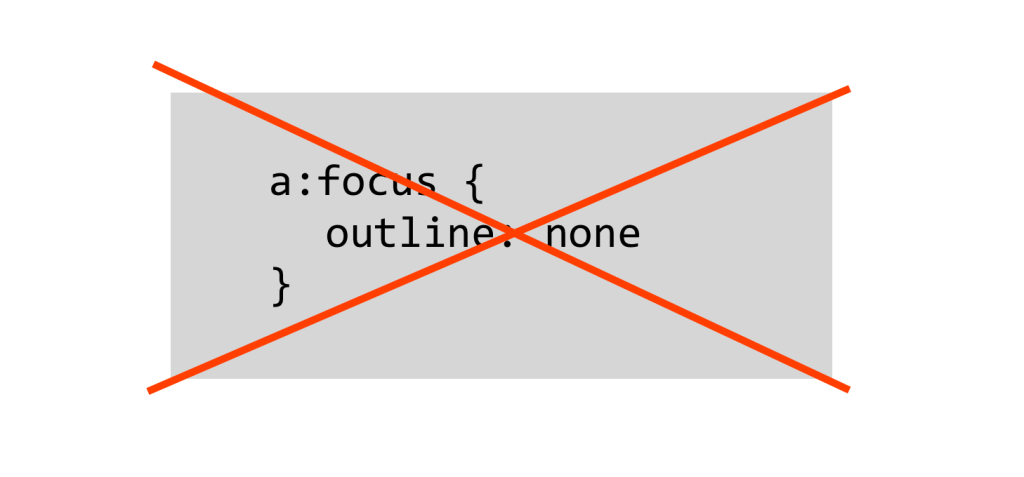
There are various reasons why some might be unable to use a mouse, but good keyboard support for web navigation also benefits power users. Unfortunately, some of the most popular CSS frameworks and resets include the following rule:
a:focus {
  outline: none
}
While this makes a lot of graphic designers happy, in practise it makes tabbing through links on a site practically impossible. Often the frameworks expect that you will redefine your own focus styles, but this rarely happens. The best option then is just to not disable them in the first place. A good second is to make hover and focus styles the same:
a:hover,
a:focus {
  background: #990099;
}
In forms, it can help to have a similar distinction for the active element, especially if the form is long. Placing form elements on top of each other (instead of side-by-side) will also make keeping track of the focused element easier.
Make pop-ups easy to close

Pop-up windows should be easy to get rid of, whether they’re “virtual” modal layers or actual windows (increasingly rare). It doesn’t matter if the pop-up was created via a user action or not, closing it should be simple both with a mouse and a keyboard. Make the click target big enough (see below) and support the ESC key:
$(document).keydown(function(e) {
  // ESC pressed
  if (e.keyCode == 27) {

    // ...insert code to hide popup here...

  }
}
Big click targets
In today’s touch-device-filled world you should be doing this anyway, but large click zones will also help anyone with difficulties using a mouse, such as people with Parkinson’s, the elderly, or you after a wild night out. For touch, a generally recommended size is 44 pt. Read this post by Luke Wroblewski on Touch Target Size.
Dropdowns
A long-time favourite annoyance of mine are large dropdown menus that just won’t stay open. Setting a delay (500-1000 ms) before a menu closes (after the mouse cursor leaves) will help all users. Also, test tabbing through your menus with a keyboard, can you tab through to the dropdowns?
Superfish and hoverIntent.js will help with both of the above issues. Superfish also supports touch.
Support custom stylesheets
According to the European Dyslexia Association, dyslexia affects about 8% of the population. Often dyslexics find that using a different font (such as Comic Sans) can help reading, so it’s a good idea to keep basic typographic styles fairly simple, thus making them easy to override with a custom style sheet.
Other good tips on catering to dyslexic users can be found in this blog post by UX Movement.
Use WAI-ARIA landmarks and roles
This is the definition of WAI-ARIA from the World Wide Web Consortium website.
WAI-ARIA, the Accessible Rich Internet Applications Suite, defines a way to make Web content and Web applications more accessible to people with disabilities. It especially helps with dynamic content and advanced user interface controls developed with Ajax, HTML, JavaScript, and related technologies.
In brief, ARIA includes a large set of attributes that add more semantics to HTML, and are especially useful in making complex dynamic UIs accessible to assistive devices, such as screen readers. However, the accessibility of any web page can be improved by ARIA landmarks, such as role="article", main, navigation, search and complementary. All popular screen readers support dividing the page into according to these roles, thus making skipping to a specific area of the page quicker. I won’t go into more detail here, instead I suggest reading this introduction to landmarks on the Opera website.
- For testing the landmarks on an existing page, I recommend the ARIA Landmark Inspector Booklet.
- A great blog post on using
aria-label: Making Accessible Icon Buttons by Nicholas C. Zakas. - On WAI-ARIA authoring practices (W3C)
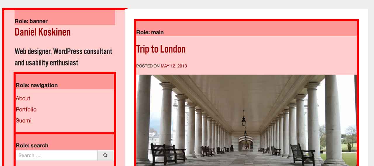
The default theme for WordPress has included ARIA landmarks for at least the last 4 years.
Use enough contrast and support zooming text
For users with low vision and/or color blindness, a sufficient contrast between foreground and background is important. Total black-on-white is not necessarily the best option though, instead a slightly off-black (#222) on off-white (#eee or #ffe) might be better for a lot of users. For a long list of different contrast checking tools, go to 456 Berea Street.
Also check that your site supports zooming without breaking the page and hiding content. Using Ems and percentage units will help there.
Books
There are many books on accessibility, but I can recommend these:
- The Accessibility Handbook by Katie Cunningham (published 2012)
Short and practical and fairly up-to-date, my presentation (and this blog post) was strongly inspired by it. - Web Accessibility: Web Standards and Regulatory Compliance by Richard Rutter et al. (ISBN 978-1590596388, published 2006)
Somewhat out of date, but gives a very comprehensive view of web accessibility.

One response to “Accessibility Tips for Front End Developers”
Pretty good tips. There is a lot to learn in this area. I used to use Superfish dropdown menu but it had some issues with mobile menus. I should probably look at it again.
There have been discussion in wordpress.org Theme Review mailing list also. Here is first draft.
http://codex.wordpress.org/Theme_Review#Accessibility
LikeLike